Saltworkstudio Florence: Botticelli Days

Floating into Florence with Botticelli’s Birth of Venus.

We view original art to have a hidden moment with it, intimacy. Like Venus, patron of art, we want to have a relationship, a love affair, something personal. Botticelli was the high point for me. The chance to see so much of his work in the Uffizi was a revelation. Heresy: I like Botticelli better than Leonardo. Leonardo was a techie; Botticelli was a mystic. I write here my own discoveries from looking at the originals. This is an art geek post, so be forewarned. I don’t know if my revelations are unique, but at least they are mine.

There is movement everywhere in a Botticelli painting, but in the atmosphere. The roses are floating down, her shell boat is literally floating in on the tide, washed in on the foam. Venus was “foam born” and if you look at the veils of wave at the bottom of the shell you can see the shell moving. Botticelli mixed alabaster with tempera to add a light pastel opacity to the painting. The sea, with its little waves, has the color and flatness of maps; he was good friends with the explorer Amerigo Vespucci and the families lived close to each other, so I regard the flat sea as another visual pun. Every part of nature is flowing, waving, alive. This reminds me of the movies of Ridley Scott, who often has snow, ashes or petals drifting down, especially in epic scenes.

I found out that Botticelli had probably been trained as a goldsmith after looking at the gilding used as a painterly element. In Venus, the whole atmosphere is that of dawn, and he using stripes of gold on his orange tree trunks— the oranges in bloom with their sweet blossoms to add a ghost of fragrance to the work—reflects that. He uses arcs of gold on the pebbles of the earth bank on the right, where Venus is about to step off. The shell casts a long dawn shadow.

Look at the gilded hatchings on the orange tree trunks, and the map-like land meeting ocean.

There’s a real joy in nature in the paintings. I loved seeing the nearly invisible wild iris in the corner of the Spring painting. And there are visual jokes: in Venus, the Wind is blowing a spume at her… just like the Annunciations, with their lines connecting the angel and Mary. He’s fecundating her. Microscopically fine veils show lines of energy, light moving in waves, and connect visual elements. The veils are like starlight made tangible. About the gilding… I had not seen it used like this, on simple trunks and little pebbles, anywhere else. I saw it used only for halos and sometimes on fabric ornamentation on the Virgin’s robe. Using the gilding on trees and rocks instead of halos makes nature holy. More encoded visual puns!

The Iris. The cosmic veil touches earth and fertilizes it.
All alone with Spring. What a treat.

I ended up spending more time with the Allegory of Spring. It’s just such an interesting painting. There never seems to be much that’s formulaic in these works. I was alone for a time with the painting; that might not ever happen again.

The leaves overhead are oranges, and Mercury seems to be poking down an orange to eat with his caduceus. Mercury loves to steal things. It is very human. I think Mercury might be Botticelli. His paintings are witty. They have humor.

This Mercury looks a lot like Botticelli’s self portrait.
Do you see the resemblance?

I can’t say much about the Renaissance, but it was not about the invention of three-point perspective; that’s technology embodied. It’s in the mixing of cultures and the breaking of worn-out molds that the good stuff happens, the brief blooms, like the sixties. Botticelli broke the musty war-and-religion genres of the time with his loud paganism. It’s easy to think that these smooth faces are inventions, but I saw this museum visitor in the Map Room and I thought, oh, a Botticelli face. You think that this radiance is a painterly trope, but then there was this guy walking by. I snapped a stealth photo.

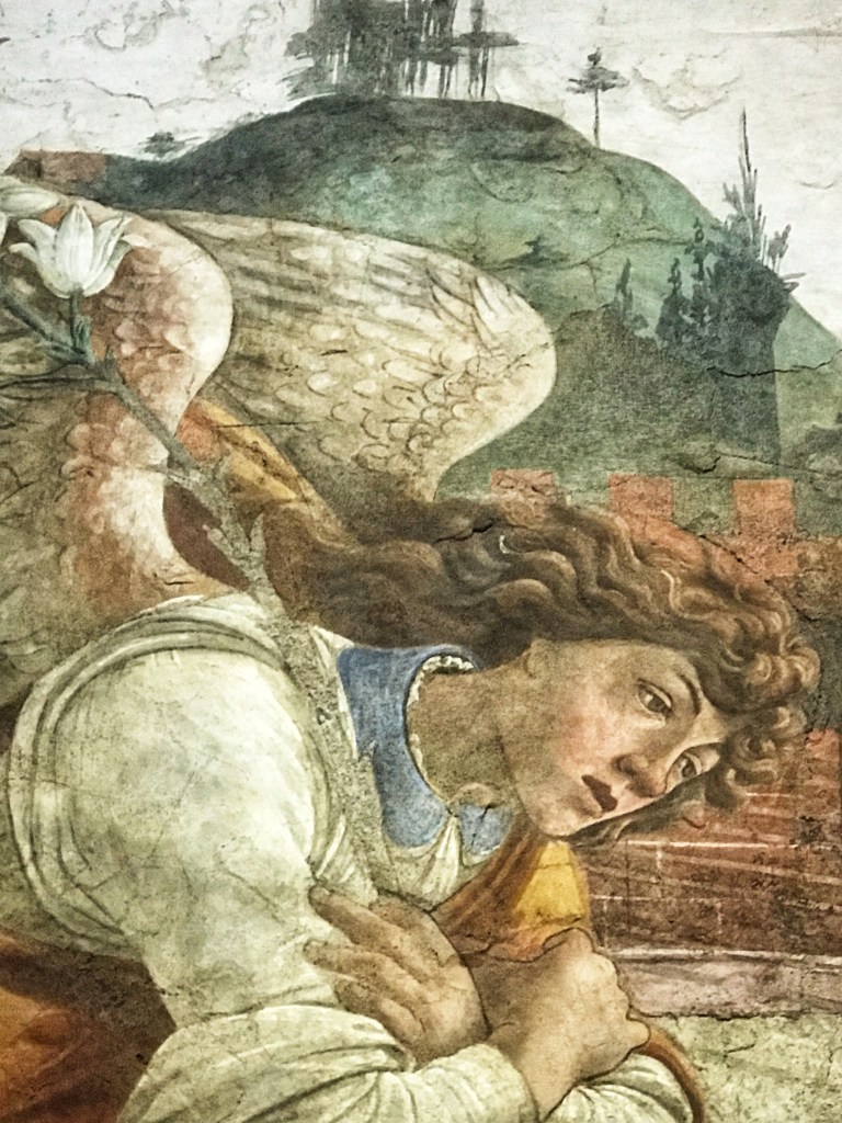
An angel in the Map Room. See how the maps look like the ocean/land in Venus?

What if Botticelli was your interior designer? This wall painting was moved intact from someone’s house. Interesting to see a Botticelli with earthier colors because the medium was different. I had not seen this one before. I would lay odds that the background in the painting reflected the actual background of the loggia, vineyard, and setting of the patron’s house.
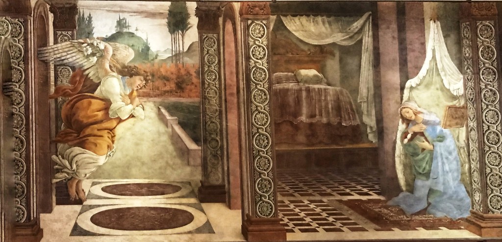
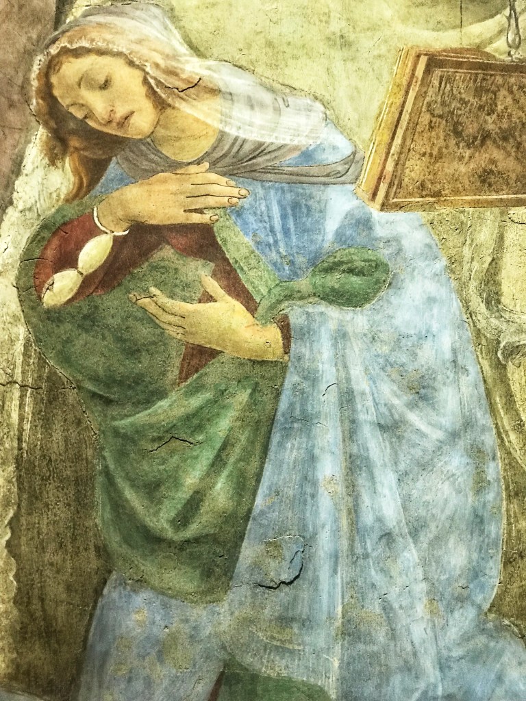
An earth-toned Botticelli fresco, huge, with some strange aspects. He visually joins the bed with the landscape, bringing the outdoors in. Also, a bed in an Annunciation scene?
Mary holds an invisible baby, with a strange green pod form on the right. The book is suspended in mid-air from a chain arrangement; the more things Botticelli could float, the better.
The angel, who looks like Botticelli again, has green tree scratch marks, very abstract, on the hill above his head.
Green squiggles again, behind another self-portrait in a painting.

More green squiggle marks behind him in another Uffizi painting

Movement, bringing real nature into painting, and starlight made visible. And the faces, and the wit. That’s my Botticelli, the one I met in person through the originals. We might need him again as our world turns back into increasing darkness.

Over Underworld 8: Quarantinis in the Afterlife

Dante notebook, from the Getty Villa Underworld show. Gouache, pen, watercolor, pencil.

What do we want most when we are traveling through an Underworld?  One ill-fated goal is to rescue another who is stuck to bring them back from Death, never a good idea: the Monkey’s Paw effect.  Better is to journey toward a happy ending, reuniting with our loved ones or God. This was Dante’s goal. Another favorite hope, a subset of reuniting with loved ones, is to be in ecstasy all the time, eating and drinking and making love and giggling– to get high. The goals of the Underworld are actually in alignment with the goals of Comedy, not Tragedy:  it should end with a reunion or party with loved ones, and you should be able to get drunk, maybe listen to some really good music…

A music band of 3 statues. The Sirens or Harpies are underworld creatures. This Siren is singling to a pipe played by a Satyr.

I made these drawings in the Getty Villa’s Underworld: Imagining the Afterlife exhibit. One thing that tickled me the most was Plato’s disdain for those who only wanted to go to the Underworld to drink wine.  There apparently was a cult devoted just to that.  As a citizen of perhaps one of the most hedonistic places on the planet, Sonoma County, California, where wine, weed, and fine food are elevated to a religion, I understand.

Plato loved wine, but was careful.  He even proposed the first age-related drinking laws: that boys should not drink before age 18, because it is wrong to add “fire to fire.” But he was careful not to elevate wine, preferring to use it as a tool for truth and celebration.  He said that to spend all our time in the afterlife “crowned and drunk” was dumb, that eternal inebriation was an unworthy goal for the Underworld.  Many of the Underworld themed wine vessels had phallic grape bunches, implying that there was even more bliss available Down There.

Detail of phallic grape bunch on wine vessel

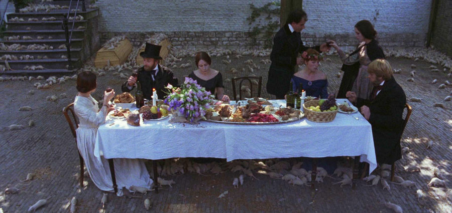
In this time of quarantine and apocalyptic thoughts, I can’t help but remember the rat banquet scene in the Werner Herzog film Nosferatu.  The people are feasting and dancing in the square in a sea of rats, because they know that they are about to die. In our world, this is a good metaphor for substance addiction; unable to stop as a world falls apart.  Dark.

Scene from Werner Herzog’s Nosferatu

Is it so wrong to imagine that some of life’s fundamental pleasures might be available after death?  I wish you surcease of sorrows, but in non-apocalyptic quantity that does not wreck your world.  Or your morning. It’s a slippery slope.

Many entries to the Underworld were portrayed as steep descents. From the Dante notebook.

From Plato to you, as you sip your Quarantini  2,368 years later:  “What is better adapted than the festive use of wine in the first place to test and in the second place to train the character of a man, if care be taken in the use of it? What is there cheaper or more innocent?”

Here I am with my quarantini and pearls, sans rats.  Here’s to all of us. And from Plato: “Be kind, for everyone you meet is fighting a harder battle.” —Suzanne

This is the eighth Over Underworld release, a online art exhibit of paintings and sketches in March and April 2020. Featured art: Sketches from Dante’s Inferno Illustrated Notes. Contact saltworkstudio@gmail.com.
View 7 previous Over Underworld Art Exhibit paintings, sketches, and essays here.

Saltworkstudio Events in March-April 2020: Over Underworld: New Work, a virtual art exhibit of paintings and sketches released on SaltworkstudioFacebook, and Instagram.  #dantesketchbook #overunderworld  #saltworkstudio


The Greek Gods and Polychromy: The Gods Weren’t White

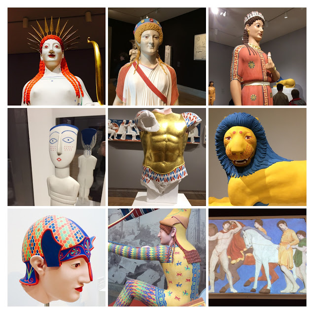
The Greek Gods weren’t white!  We just think they were.  “The Gods in Color: Polychromy in the Ancient World,” recently at the Legion of Honor in San Francisco, was a revelation.  Using minute traces of residual colors, historical material from past centuries that documented colored temples and statues, and all the resources of modern science, we now can be sure that temples of the gods in ancient Greece may have resembled a set on Black Panther more than a mausoleum.

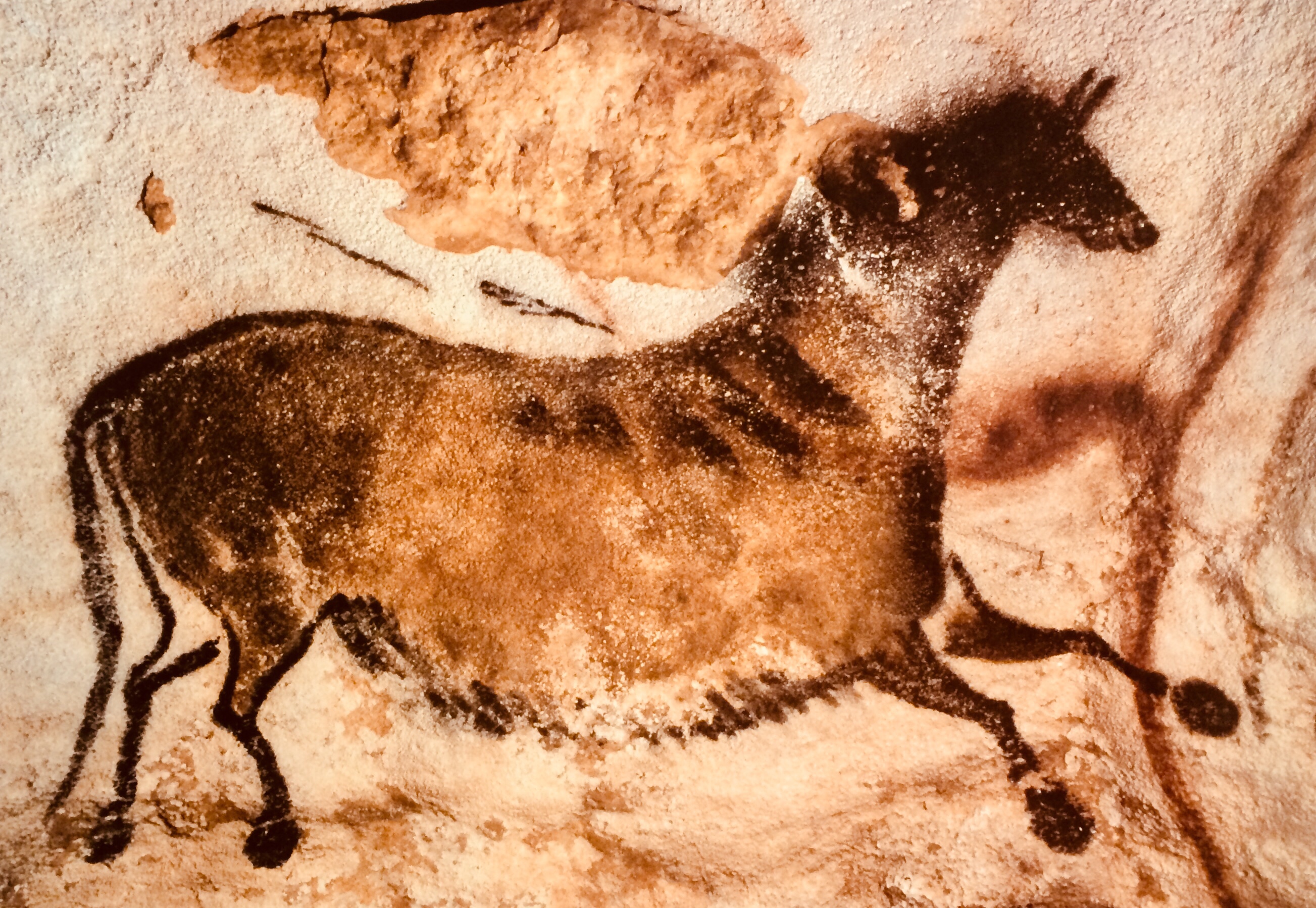
“Chromophobia” is the fear of color.  It may be wrong to apply it to a to a whole society, rather than an individual,  but I think that we live in an era of mass chromophobia.  Modernism in architecture and decor focuses on neutrals, greys, browns, black and white- with maybe a daring splash of green from a succulent.  But from the earliest times, back to the time of Neanderthal woman, we have sought and ground pigments to produce beautiful, durable colors.

IMG_7406.jpg
Vivid pigments from mineral sources.

Seeing this exhibit reminded me of the gorgeous color in ancient Roman murals I saw when I was in Pompeii, and other examples preserved in the Naples Archaeological Museum.  I notice that the stone pigments have a chalky quality with a kind of depth found in modern pastels today.  Yummy!

Girl with Horns, Naples Museum
Rich blues, greens and golds

Naples Pompeii Villa
The famous Pompeii Red. How’s that for dining room decor in your vacation villa?

Naples Archeological Museum Pigment
These ancient Roman pigment sources from the museum in Naples look yummy enough to serve at a decadent banquet.

Look at those pinkish stones!  Pink was a popular color in ancient times.

Gods in color pink goddess
A beautiful pink dress.

I speculate that it was hard to get a sort of true blue-red:  Red ocher tends toward sienna/orange/ brown, and any red mixed with a white opaque binder would turn pink. “Rhodophobia” is the fear of pink;  someone with this affliction would have had a hard time in ancient Greece, because pink tones were everywhere.

A few hundred years ago it was still possible to see traces of color on Greek temples.  Pre-photography, you could go out with your watercolorist and his camera obscura and paint from life.  There were still traces of temple color documented in the watercolors of Greek landscapes and monuments by the English antiquarian Edward Dodwell and the Italian artist Simone Pomardi.

Gods in color temple.JPG
Greek temple with some color still visible in 1805.

The complex friezes of the ancient world take on a vivid, comic book quality in color.

Gods in color frieze
What we see now vs. the original

Kore 2018
I want this redhead on my side!

The ancients used all the color available to them.  We should too.

Upcoming at Saltworkstudio: “Paleomythic”

img_7668

I’m pleased to be a co-curator for PaleoMythic, a show opening on May 4, 2018, in Backstreet Gallery.  I have long loved ancient art and found inspiration in it.  I have joined forces with master printmaker Caren Catterall and three other fine artists to explore our creation of modern myths from ancient sources.  I feel like I’ve been waiting ages to do this show… 65,000 years or so!  I hope that images recalling the sacred darkness of the cave can dispel some of the darkness rising in our collective souls.


TinyLetters and a Trojan Horse

Trojan Horse

One good thing about a real painting is that it’s a gift, not a Trojan horse.   You can look at a good painting over and over.  It will still speak, still radiate, still suggest.  When the CDC asked to use this painting on the cover of a medical journal, it reminded me of the process of Four Hands Painting with Susan Cornelis.   It turns out I also did a blog about this particular piece.

When images spontaneously appear, it makes you believe that the image somehow has its own consciousness.  The image/idea wants to manifest itself, if not through you, then someone else, or more than one person, in the case of Four Hands Painting.  If images are living things, they come alive again when someone else sees them.   Apparently the Trojan Horse wants to canter again, this time in a medical metaphor.  I see the painting as a meditation on time.  What do you see in it?

I recently started a newsletter called Symbol Warehouse Paintbox through TinyLetter. The email is more like an old-style  snailmail letter, more intimate and newsy, and reveals more of my inner process and personal life.  I’m writing them about twice a month.  If you’re interested, go to this link: https://tinyletter.com/saltworkstudio.  You can read the letters in the archive and decide if you want more.


New series: “Blackboards” and “Kerubim” open in SOFA Friday

blackboards1
“Black Elk Antlers,” acrylic and oil stick on wood, Suzanne Edminster

It’s always exciting to have a new series choose you.  It makes you famous with yourself.  A great notion has flown down to take you away its talons, like a mythical bird, the Roc.   This bird only sees you.

 Cretaceous Roc by Hodari Nundu
Cretaceous Roc by Hodari Nundu

This year two new series occurred in me, “Blackboards” and “Kerubim.”

I think much art lies outside conscious control.  These do.  Each “Blackboard” develops itself.  I have no idea of what the end result will be when I start. It’s childlike.  I see this, then I see that, then I turn the board and see something else.  I tell stories.  They develop out of the darkness of dream, the blackness of the childhood chalkboard, with markings and erasures like chalk.  And they can disappear like dreams too.

I believe art visits us.  The Kerubim series  (see below) is about visitation of ideas and phenomenon, texting from beyond, and decoding.  Cherubim are very old, going back to Assyria and Babylonia.  They orbit, rotate, have wheels, flames, eyes, thrones, and messages.

Chair Ubim, acrylic on Arches paper, Suzanne Edminster

If you can make it, drop by during August.  The opening is in my studio, Friday August 5, 5-8 PM (invite below).   I’m happy to be showing with Chris Beards, an astonishing mixed media sculptor.  I’ll be releasing images on this site through the month of August for those of you who are far away.

It’s so much more interesting to be visited by Rocs or Muses than it is to watch summer blockbusters. With ideas, when the blockbuster opens,  you become its personal theatre.  I wish you happy visitations.

Suzanne

Implied large version

Access the Facebook invitation here.  We are also open for Artwalk on Saturday and Sunday.


Painting Journal 2: Over Underworld

Over Underworld, acrylic on canvas, 36" x 48"
Over Underworld, acrylic on canvas, 36″ x 48″

The Over Underworld series features high horizons and chaotic, rich undergrowth. You can climb up and down the layers of it, and the black ink spatters underneath sometimes look like animal forms. The top has modern, intereference paint; the top invokes architecture, the conscious mind, technology and civilization. It’s shiny and bright, while the underpart is rough.

The concept behind each art piece is as vital to me as the finished work… often more vital. Abstract work has its own demands because it is unmoored from the anchor of representation and floating out at sea.

Students ask me, “How do I know it’s finished?” I think my true answer is that it’s finished when your dialogue or conversation with the painting is somehow complete. This is true whether or not the painting is a “success” at the moment. Ask your questions not ABOUT the painting, but TO it. If you can know it as complete, whole, and satisfying, your viewer will as well. Knowing an abstract painting is finished is also an abstract idea!

I believe we shouldn’t dwell too much on the underworld, the unconscious, the uncivilized. We don’t need to invite it. It will always come to us unbidden, as these paintings did to me.

Small Work, Big Impact: 40 venues go small at SOFA Sat. Feb 2, 5-8 PM

Suzanne Edminster, Sea Garden, acrylic on paper, SOLD

Small does not mean diminshed  intrigue or impact. A good small painting reads big.  I remember that in the Denver Art Museum that you could see the Georgia O’Keefe small painting from across a vast room, before we could even identify it as hers.  It just shone.  I’ve been working on larger pieces for a while now. It’s an interesting lesson: large is NOT small scaled up somehow. The dimension changes meaning. This one will be on display this Saturday.

Confession: the very small works are often traces of projects that lead to larger works for me. My own sense of detail is not robust; I prefer the BIG. Even my handwriting is large and scrawling. I like to work small on paper– it feels more open and free. But sometimes I do “smaller” canvases: 10″ x 10″ is one of the smallest. I like mixed media on smaller canvases to make more of an impact. Everything is small-ized now. Just think of your Iphone and Ipad.

Suzanne Edminster, Days of the Dead, combined media on canvas, 12 x 12 inches

Small can be very expressive. I did the piece above when my dad was diagnosed with cancer. I wanted to make a response that expressed sacrifice and rebirth as his living spirit started to transition.  The Little Sun Cow below was just pure play and joy.  We all have our art totems.  Cosmic and regular cows are  mine.

Suzanne Edminster, Little Sun Cow, acrylic on paper, SOLD

One artist who has a great sense of the small is Susan Cornelis.  You can see her latest cool “fossil” smalls here. Come visit me this Saturday, or, better yet, start your own  small series. Small can lead  to big things. Surprise yourself!

SOFA Small Works