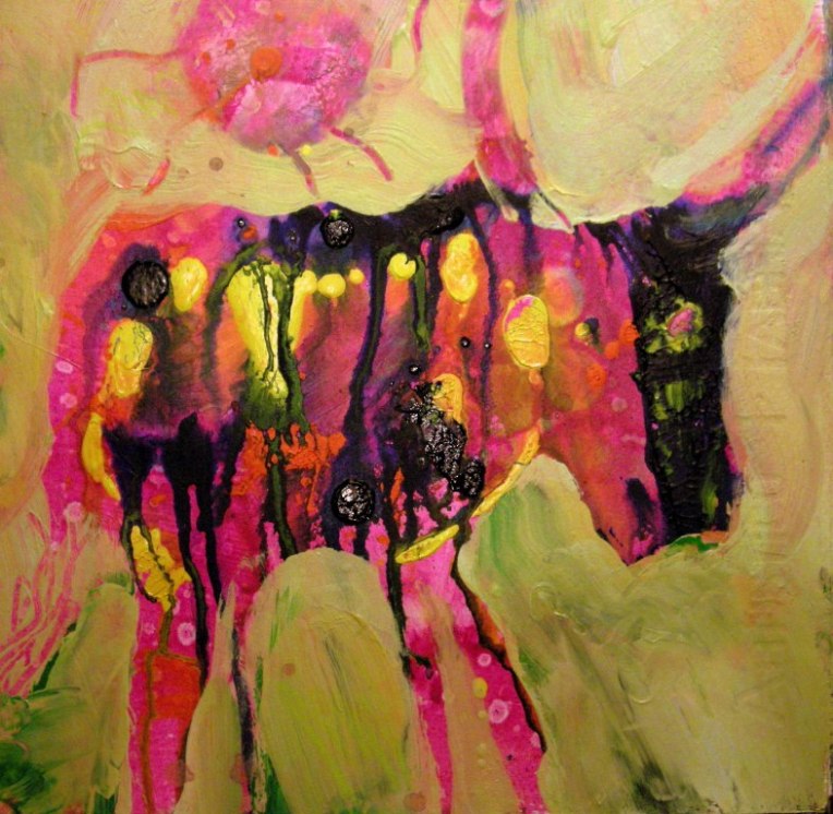
A Quick Peek at a Painting Collaboration Process

Ever had one of those brilliant midnight ideas and let it drift away?  Well, painter Susan Cornelis  had one and made it a reality, that rare bird,  a painting collaboration. Encouraged by B.L.T., the collaborative project of Lisa Beerntsen, Tony Spiers, and Bob Stang, Susan asked me to be her partner in an a collaborative painting series with abstracted themes.

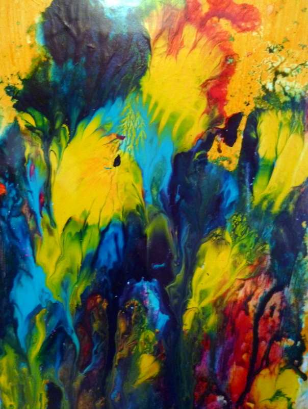
We began on Saturday in Susan’s studio.  Making it up as we went along, we decided to start with smaller paper pieces to get a feel for a larger series on canvas.  Here’s a start by Susan Cornelis:

Susan Cornelis Gold Start 6

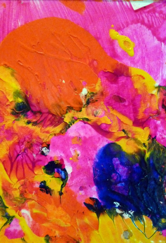
As you can see, the starts were so beautiful it felt very risky presuming to “finish” them!  I “finished” the start you see above  with this version below.

Suzanne Edminster Gold Finish 6

 Here’s  another one of Susan’s brilliant starts:

Susan Cornelis Gold Start 4

 And my finish below:

Suzanne Edminster Gold Finish 4

A secret: this kind of painting is addicting, riveting, and fun.  To see more of the project, including a few of my starts and Susan’s finishes, visit Susan’s blog, Conversations with the Muse.   Cooperators are standing by, so more to come.

Saltworkstudio Large Painting Class: 5 Clues, and Cool Painting Titles

Cythia Heimowitz' s hands on her painting

What’s a large painting for you? 12  by 12 inches?  6 feet by 6 feet?  A mural? Anything on canvas? 

 What’s a large series?  Two paintings? A hundred?
 
In Sunday’s Saltworkstudio Paint Large class, our goal was to clarify our intentions for a series and begin to paint on larger surfaces.   For the purposes making headway in a four-hour class, I suggest students bring half to full sheets of watercolor paper, or three identical canvases up to 30 inches on a side.
 
I won’t share the entire process of the class, but it did result in the stunning headway on painting series you can see in the slideshow below.  All paintings shown were done in class on Sunday, and they are very fine starts. Some students came in with well-developed ideas, and some came in “blank.”
 
 I had to figure out how to model and convey my own process when working on a large series of big surfaces.    We used some of the  ideas below as guidelines.
 
  1. A large painting is not a small painting “blown up.”  Start fresh.  “Toto, I’ve a feeling we’re not in Kansas any more.”  You are in a new, large, foriegn country.  Explore it.
  2. Composition is critical.  Plan a minimal, flexible composition format or idea.  It could be “Golden Mean” or “Diagonal.”  OR it could be quirkier: “Large X-Ray Animal in the Middle”  or “Floaty Fractal Bubble with Connectors” or “One Line High Horizon.”  Vary each painting in  your series, but stay within one compositional “meme.”
  3. Texture your surface first, then put on large swathes of color or paint BEFORE “starting” the painting.  Keep it very loose at first.   You’re getting hold of your surface, getting acquainted with it…developing a relationship.  The start is like a first date.
  4. You need big ideas for large paintings.  Work in your notebook. Catch the ideas and desires that hang at the periphery of your conciousness. We’re like Adam naming the animals of our imagination into existence… and some of them are very odd creatures! Don’t be afraid of titling your paintings right at the start.  You can always change them later.
  5. Remember, it’s only paint and canvas.  Sure, you might fail.  So what?

Enjoy the slideshow!  The Mythic News and Studio News are after the slides. Students, please leave some comments about your process and your series concepts and names.  I’m amazed by your work.

This slideshow requires JavaScript.

 
Mythic News:  You can get great abstract painting titles from myths and legends.  I just bought the beautiful, witty book  American Indian Myths and Legends, selected and edited by Richard Erdoes and Alfonso Ortiz.  Here are some titles I’d love to use for abstract paintings: The Origin of Curing Ceremonies. The Well-Baked Man.  Blood Clot. Jicarilla Genesis. Emerging Into the Upper World.  Great Medicine Makes a Beautiful Country.  The Theft of Light.  A Trick of Moon.  And more.  At the end of his life, my father told me that my great-grandmother was Native American.  It was the skeleton in the closet and a family secret.   At last I had a context for my resonance with ancient art.  Is there a DNA for visual desire, the passions of the eyes?
 
Saltworkstudio News:  All my classes are full through March!  I’ll be posting the next Spontaneous Construction date and time in the new year.   
 

Thanksgiving Eye Candy for Your Virtual Feast

Sea Garden, acrylic on paper, 5" x 7", Suzanne Edminster

Dear reader, I wish you a delicious day.  I shall be dining in a truck stop in Arizona,  Tonopah Joe’s, made famous in the movie Alice’s Restaurant, with Scott, my husband, and other travellers.

Pure paint is so enticing. I put these on your eye’s table, for your enjoyment.  I make them by painting a bright background, then squeezing on globs of color.  Then I press another surface on top of it, peel it off, and let it dry.  They are deceptively simple;  most don’t work, but when they do,  you’ve just received a chocolate from the candy box of Fate.  Now that I’ve told you how easy they are, do you still respect me in the morning?

We can celebrate with words as well.  I offer you synonyms for  giving thanks, from the lumbering Thesaurus: praise, benediction, paean, grace, recognition, bless one’s stars (archaic, but beautifully true),  acknowledge, appreciate. My thanks to all of you who have invited my work and words into your in-box in the last few months. Sniff. 

Meadow, acrylic on paper, 5" x 7", Suzanne Edminster

Mythic news: The Cornucopia  was the horn of the goat that suckled Zeus.  It overflowed with inexhaustable food and drink. Everyone who’s anyone among the gods loves it. Fans of the Cornucopia include Demeter for the harvest of fruit and vegetables, Dionysios for the wine, Priapus for the sexy fun, Flora for the flowers, Earth, Autumn, Hospitality, Peace, and Concord.  May we all dine at this table!  Hear, here.

Studio news:  I’m traveling in Arizona this week with my Sprockett Rocket in my pocket!  What’s that, you say?  More soon, when the images are developed for your pleasure.  Yes, it’s real film.  Remember those days?  Please comment if you like something here.  I’ll respond as soon as I am back in civilization.

5 Tips for Painting with Collage

What’s collage painting, mixed media painting, or combined media painting? How does it differ from collage? 

How can you use collage elements in painting without being highjacked or overwhelmed by the collage image?

Here’s a simple rule of thumb: A collage painting is more paint than collage elements.  The paint is 60% or more of the painting.  The collaged parts merge and meld seamlessly into the whole. 

 How to do it? Here are 5 tips. All paintings shown here are acrylic paint on paper or canvas.  I affix collage pieces to the surface with glossy acrylic gel medium.
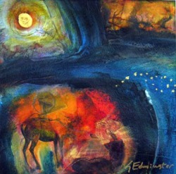
1. Use only your own images whenever possible, including photographs, text, and your own sketches and handwriting.  You can also use copyright-free black and white images.  Copy and recopy the same  images in larger and smaller sizes at a copy store or using a laser printer.  Black and white is easier to incorporate, and leaves the color elements to the painter and paints.  I prefer to avoid colored magazine images, as tempting as they are.  The more you play with a single image by altering size, color, dimension, the more freedom you will gain  in painting.  You’ll own the image, rather than the image “owning” you.

2. Choose a theme. I used non-copyrighted Dover deer. Avoid themes that are intensely personal, like pictures of your dog, your mom, or your child.  You need to have a bit of distance to use images effectively, or to rip one up.  Eventually you’ll develop image banks of differing themes that become your private visual language.  
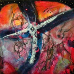
3. Paint first.  Put color on the surface, or paint a very sketchy painting, then affix images, then paint some more.  Painting first, before applying images, establishes that it is more a painting than a collage.  For all of these I chose a crucifix composition and applied paint first.  Then I put down ripped black and white collage images.  A warm background is good, as it can glow up through layers of paint.

4.Be willing to sacrifice the image.  Let go of the image you love and let it disappear, if the painting demands it. Show only a part of it.  If you want to keep it perfect, do regular collage, not collage painting.  This is one of the hardest parts of using collage elements in paintings.

5. Cover your images with glossy gel medium or UVLS varnish as you apply them.  Then you can pile on coats of paint and still wipe back to find them.

Toss the collage boxes and go back to only a few images.  Use them  thoughtfully in series of paintings. And have fun! 

Please use the comment section for questions on the collages or techniques.  I’m happy to share what I know.  If you’re one of my student who gets the blog, please share something about your experience with collage painting.

Mythic news:   Deer are symbols of sacrifice and purity, often used in Christian iconography.  It was said that deer gathered at the foot of the cross where Jesus hung.  I used them here  in these three works floating up and down through a penetrable horizon of birth and death, ancestor souls.  Collage itself belongs to the realm of Kali: dismembering  of paper , appropriation of image, rebirth of pieces into a new whole.  The goddess of Necessity wields the scissors and snips the thread of life– or the image.

Aurochs Moon: A History of Home

A History of Home, acrylic combined media on canvas, 36" x 48", part of the Terra Incognita series

Ahhh, home sweet cave. I wanted to do an imaginary landscape that was like a child’s drawing, an aboriginal painting of mythic locations, a bright map with line engravings of the entry to inner worlds.  This painting, originally titled “Aurochs Moon”, shows various signs upon entry to the cave or just inside it.  The Aurochs was a cow almost as large as small elephant. Aurochs are the bulls and cows of the Paleolithic cave art.  They lived on until the 16th century in the forests of Eastern Europe, where the last one was eliminated as hunting game for the rich.  A variety has been genetically re-bred in France as Heck Cattle

This painting, one of a triptych called High Pastures, transformed several times.  I wanted to keep the heat of the bright orange underneath, to do a map with impossible colors.  You’ll see transfers of line drawings over all, petroglyphic elements using the paint as a wall that lets images emerge from another realm.

Why the cave? I think the cave is our brain dreaming, our true home, the hearth that underlies any location we happen, temporarily, to live. The alternate name for this one is “A History of Home.”  My own history of homes is a long one. I’ve lived in rural California (Los Banos and Merced), urban California(San Francisco Mission District, pre-gentrification),  coastal California (Santa Cruz), and now northern California (Santa Rosa).  Urban Hawaii (Honolulu and Waikiki) and rural Hawaii, Na’alehu near South Point on the Big Island.  Munich and Freiburg, Germany, and southern Norway. Bangalore, South India.  When I lived there it only had four million people, but now it has topped five million— definitely urban.

Wherever I went, there I was.  Each place had a dream at its centre, realized or not. And you, dear reader? What’s your history of home?

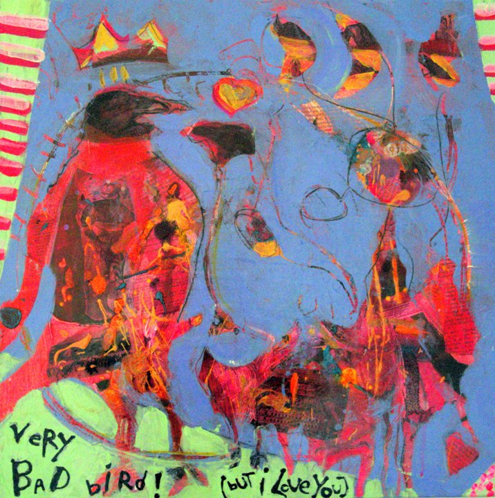
Very Bad Bird! (But I Love You)

Copyright Suzanne Edminster

Oh, that Bad Bird. Have you had a naughty-boy dog? cat? boyfriend?  (I know you have.)  I painted this as an homage to that thing in us that seeks a little bit of darkness.  Even if they’re not good for us, we love them.

I started this painting by collaging a Matisse book that fell out of its binding to the 24″ x 24″ canvas.  I like painting on substrata that is almost fully obscured.  The Bird is the Raven King, a  black-feathered emperor of darkness, impossibly charismatic.  There’s a girl bird suggested in there.  You can see ravens underneath in the collage layer, but I meant this painting, with it’s little pink and green “curtains” on the side, to indicate a tragicomic scene in the drawing-room comedy of our love lives.

I gave him a crown, because he rules.

Who’s your Bad Bird?

News: a two-blog day! Woof!  Thanks to great friend, writer, cook and painter Sharyn Dimmick of the Kale Chronicles, who was kind enough to feature my Sonoma Pears Poached in White Wine, and a painting of a nocturnal pear.  Don’t miss her unique style: original art paired with each recipe.  She is that goddess, a woman who knows how to use her both her CSA veggie box and her paint box.

Cow Licks Up Universe

Here’s your myth for the day, dear readers.  Did you know that in Norse mythology Auoumbla, the primaevil cow, actually created mankind?  She licked away the icy salt blocks of the first creation, sculpting them with her warm tongue until first a man’s hair appeared, then a head and a whole man.  I love making cows with abstract shapes rolling around in them like their complex factory stomachs.  On my last visit to the Central Vally I photographed cows right outside our house, their shining, massive flanks moving like hot mountains.

In last Sunday’s studio class, we painted flourescent pink and cadmium orange underpaintings, then spattered them with Golden Acrylic liquids.  This is just pure play to loosen up.   I like hot, bright underpaintings because I sometimes think they make the painting breathe and heave a little, generating imaginative form.  Then you carve with opaque paints like the cow’s tongue on the ice and things pop out.  Primitive creation is fun, letting us regress to being mucky little kids with cosmic questions.

Wierd creation myths and wrong, kitchy color give a wild spin to the day.  Abstraction and mythology read the world through metaphor. Auoumbla says, take a lick at eternity.

Interference Paints and Alchemical Acrylics

In my last Saltworkstudio class we experimented with interference colors.  Painters are often suspicious of these paints, harboring a worried feeling that incorporating them is the equivalent of a child dumping a mound of red glitter on Mom’s homemade Christmas card, an instantaneous road to kitschy work.  They do have that same quality of toylike holographic change as you shift angles, like Jesus’ eyes opening and closing as you move the 3-D postcard: unnerving and  miraculous. Interference colors are the colors of outer space, in a sense anti-colors, because the show up only by floating on a dark background. Think nebulas, deep space, and the formless cloud Captain Kirk sees pulsing on the galactic horizon.

 On a white surface, they virtually disappear. Nancy Reyner does large-scale, moving abstracted landscapes with layers and layers of them.  If you can make a “value” painting, that is, a black-grey-white grisaille or painted cartoon that has large areas of darker background, you can use them for mystery and emphasis.  They have that phantom quality: like ghosts, they can barely be photographed.  Like ghosts, you have to see them to believe them.  I

Daniel Smith has always excelled with iridescent, interference, and their own Duochrome line.  I particularly loved the Interference Gold and Copper over black.  The colors are sophisticated neutrals with that alchemical edge.  Scratching into them to reveal the black underneath with heiroglyphic marks made me feel like I was creating texts and tablets from a lost continent.  For strange landscapes, I think Daniel Smith’s color Iridescent Topaz is amazing… a sort of tarnished gold over soft grass green.  And I love the Duochrome Electric Blue… a startling shade that can be used for sky or a bird’s wing or for the brush of thought through the space of a mind.Paint an anti-landscape or a stellar event or decorate your dark-surfaced mood. For more interference paintings, visit www.saltworkstudio.net and see class and event photos.


Dover Image Joy

Call me a fool, but I love Dover images, even if I don’t use them often.  A baboon, a lizard, and choirboys lead the way, while a mammoth skull bellows.  I rushed into the studio, took down a large painting start (orange with flourescent paint) and made a quick assemblage of things to inspire.  Dover images have a rich, black and white web of texture.  I like to enlarge them at Kinko’s on regular copy paper, then rip them freely.  In pieces, you can’t tell what the original image was, but I always think that somehow, the network of lines “remembers.” Paste them down right on the canvas, or, if you’re patient, use an image transfer technique.

Dover Images are a metaphor machine.  Just place any two side by side and see what they tell you.  The choirboys with the mammoth skull?  Well, in the old days we worshipped the animal world, especially those that could kill you.   The skull and the lizard?  We’re immediately in the desert the desert, or the underworld. And, by the way, they’re not copyrighted… they have officially entered the realm of the archetype, the eternal.  Forge your bonds with the archetypes.   Invite a Dover book to dinner.